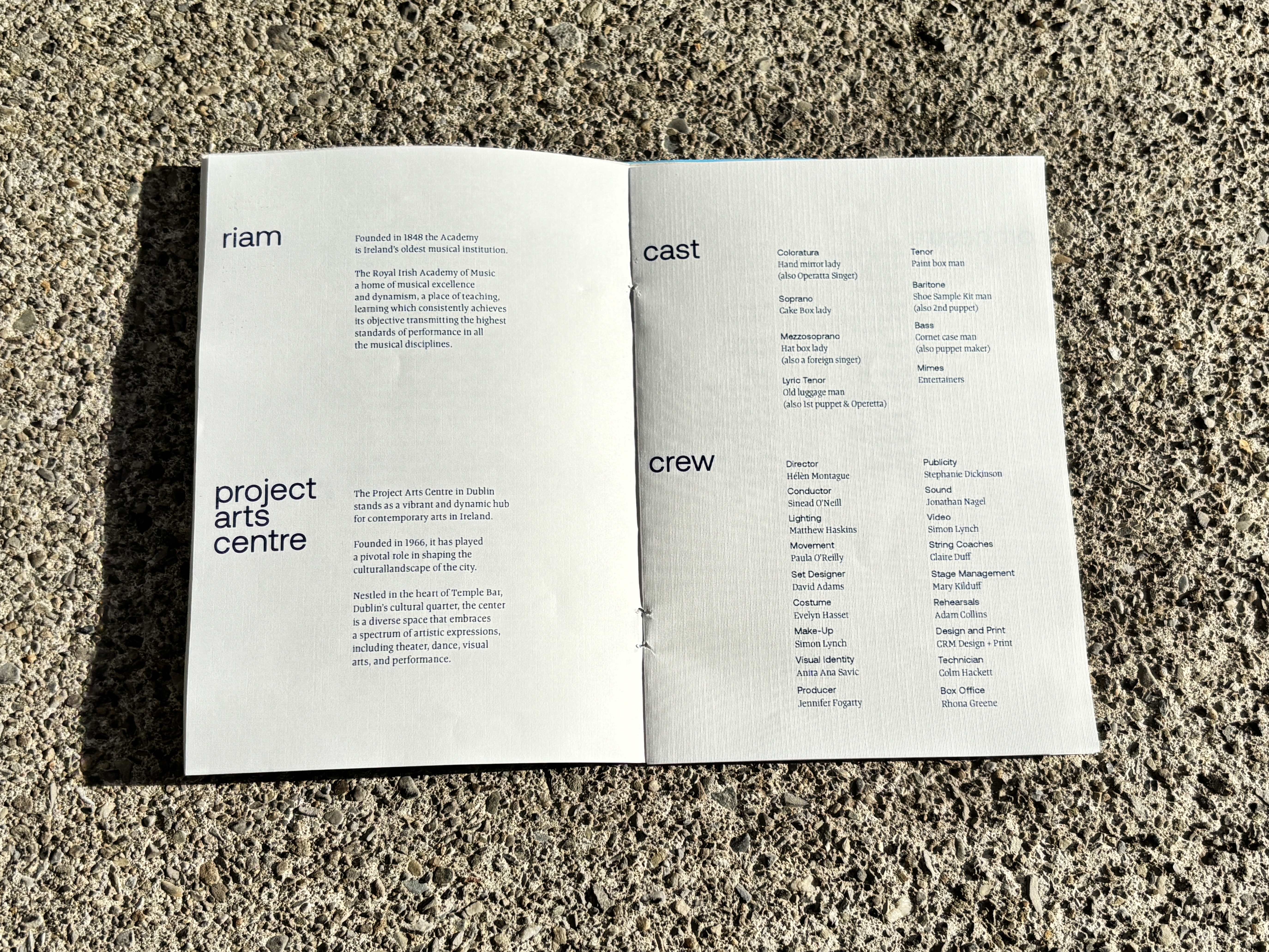
Postcard from Morocco is an opera by Dominick Argento set in a timeless waiting room, where a group of travellers guard their possessions with obsessive secrecy. Each object becomes a stand-in for a hidden identity, blurring the line between appearance and reality.
The challenge was to create a visual identity for the RIAM and Project Arts Centre production that captured this tension between what is revealed and what remains concealed, while generating intrigue around the performance itself.
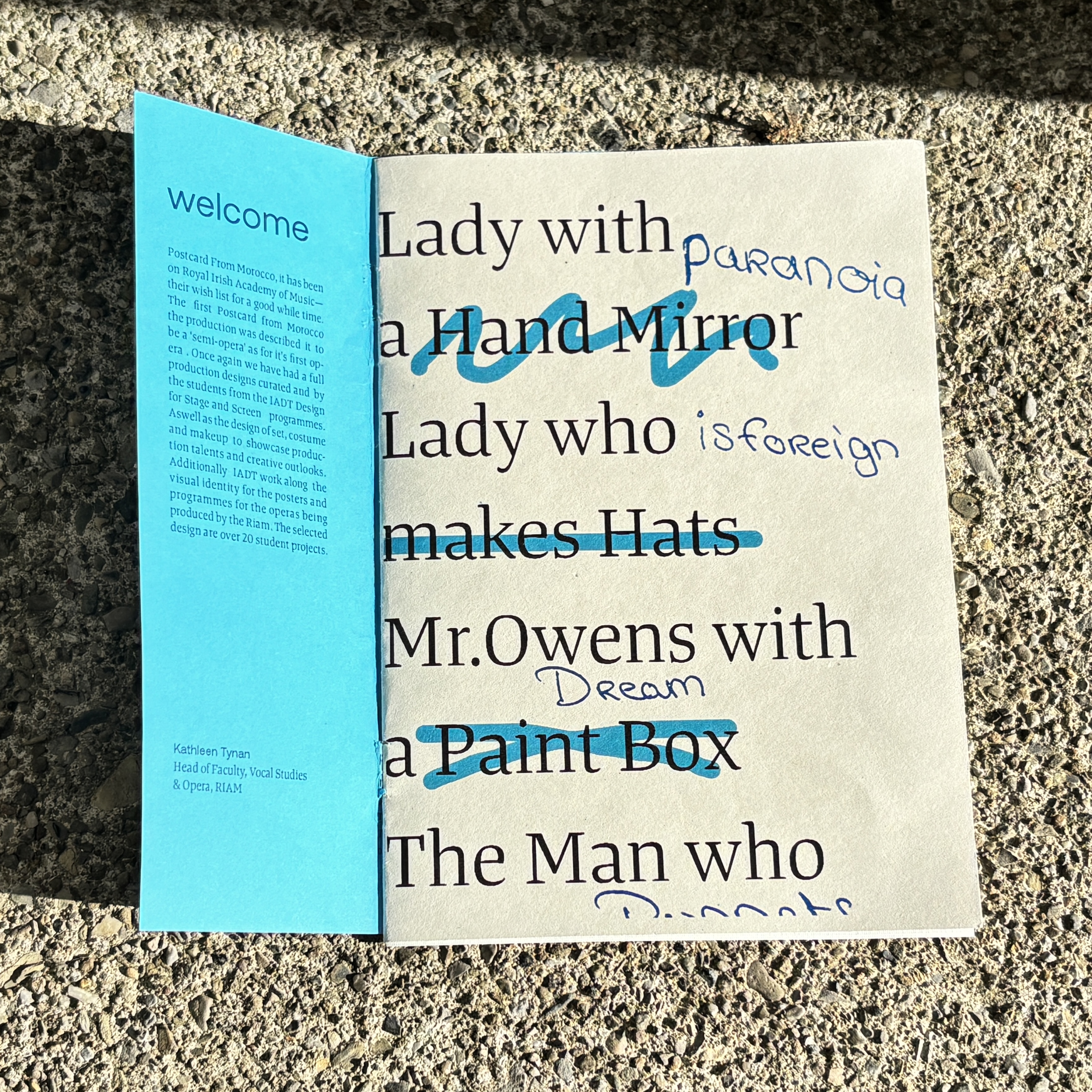
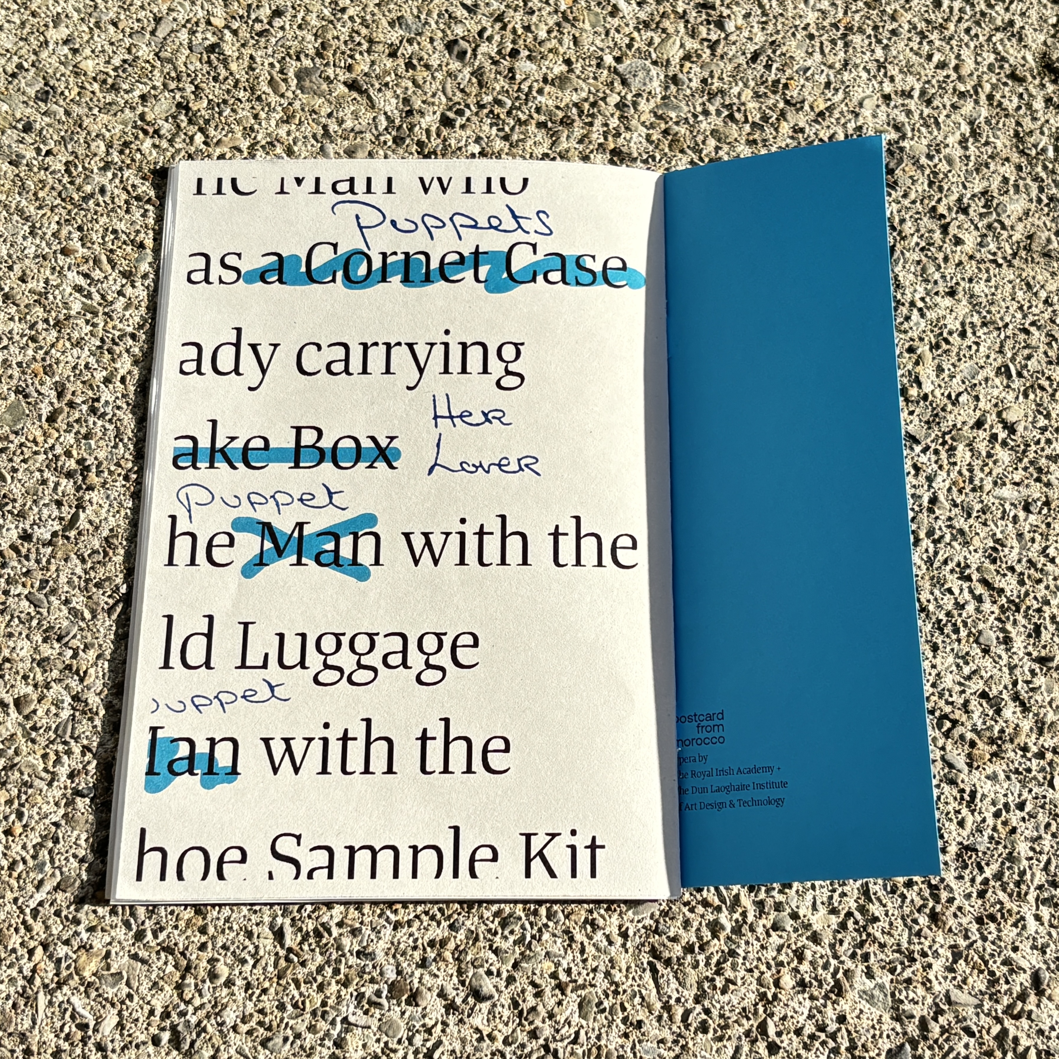
Revealing Character Through Possession
Rather than focusing on the opera's setting or narrative, I concentrated on the relationship between the characters and the objects they carry.
The travellers are never defined by their names but by their possessions, making these objects central to how identity is constructed throughout the opera. I used this idea as the foundation for the visual system, exploring how hidden information could sit alongside public identity and create a sense of uncertainty.
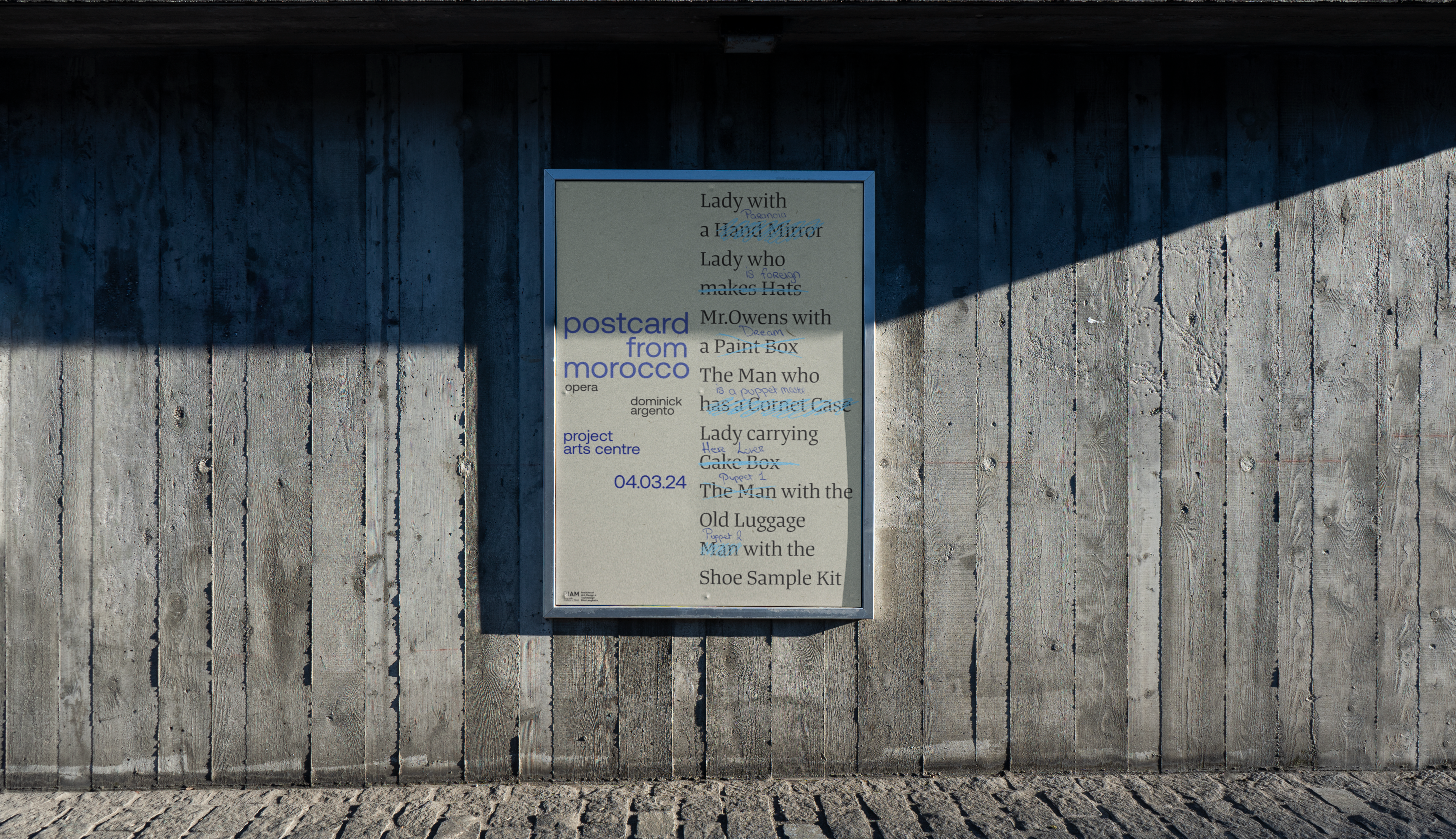
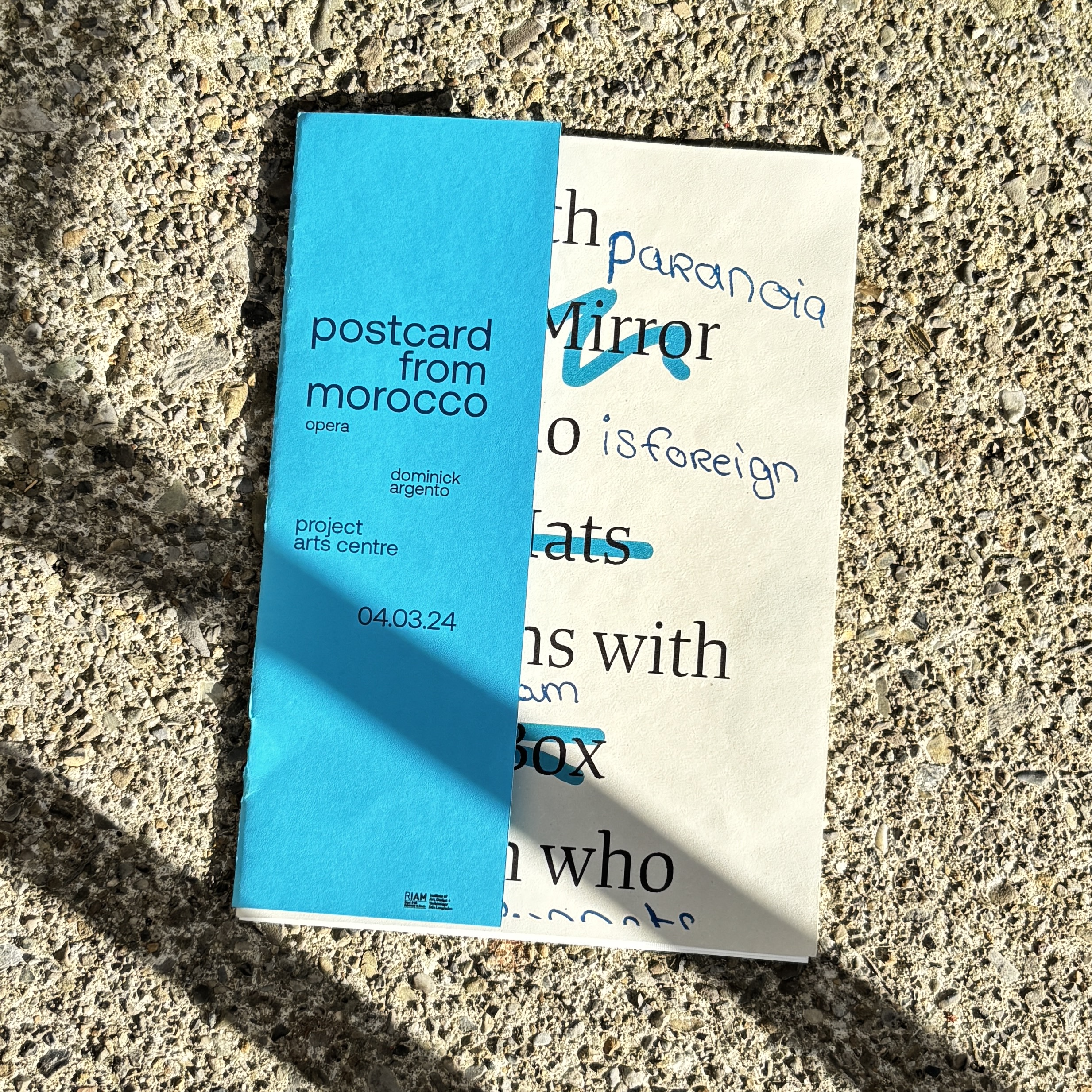
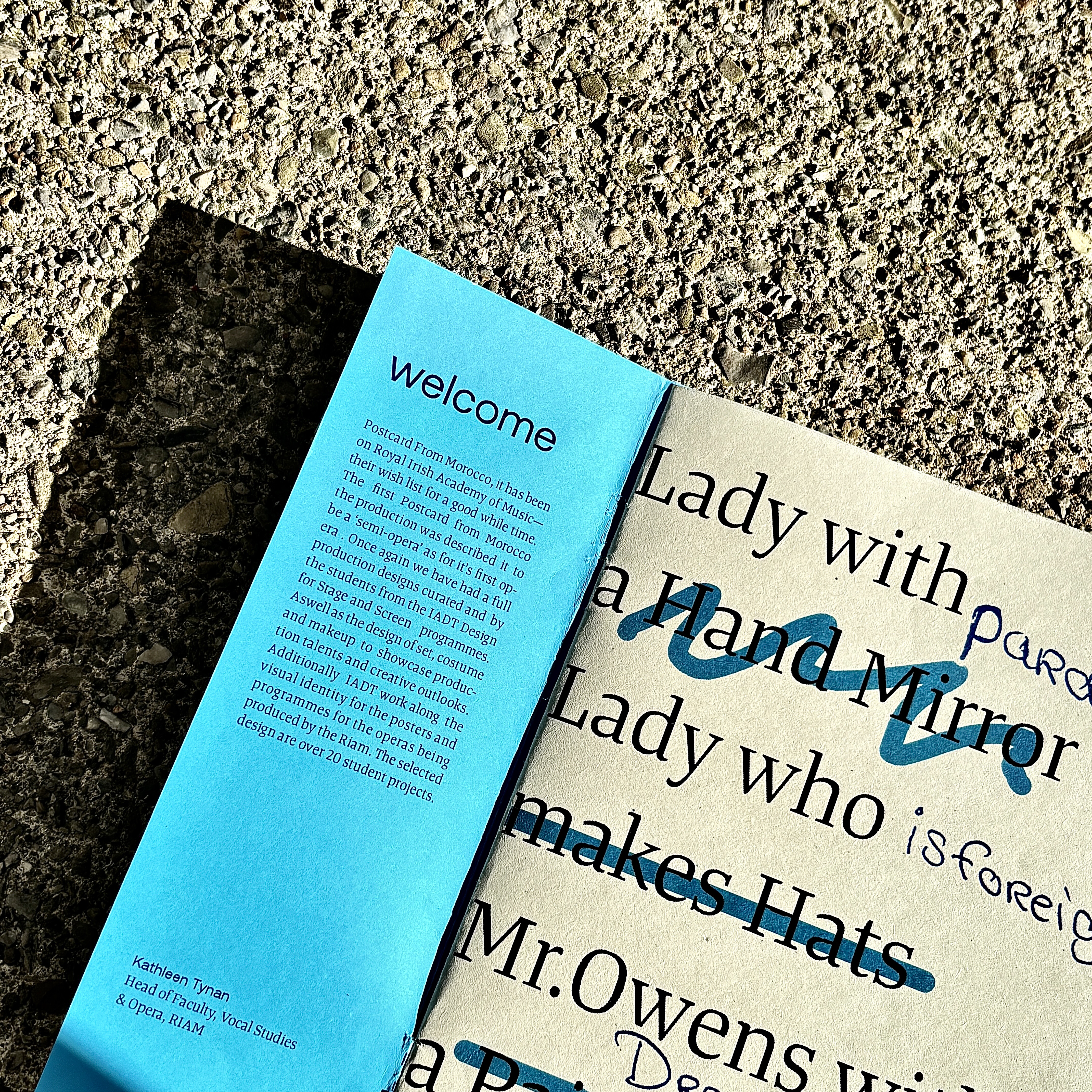
The typographic list became the central device of the identity.
Rather than leading with imagery, the design foregrounds the characters through descriptions such as Lady with a Hand Mirror, The Man with a Cornet Case, and The Man with the Old Luggage. Set at display scale, these titles become the primary visual element, while handwritten annotations are layered over them to reveal fragments of each character's concealed identity: paranoia, is foreign, her lover.
The contrast between the structured typography and expressive handwritten notes creates a visual tension that reflects the themes of the opera. The identity was applied across posters, programmes, postcards, and e-tickets, creating a consistent visual language across the production.
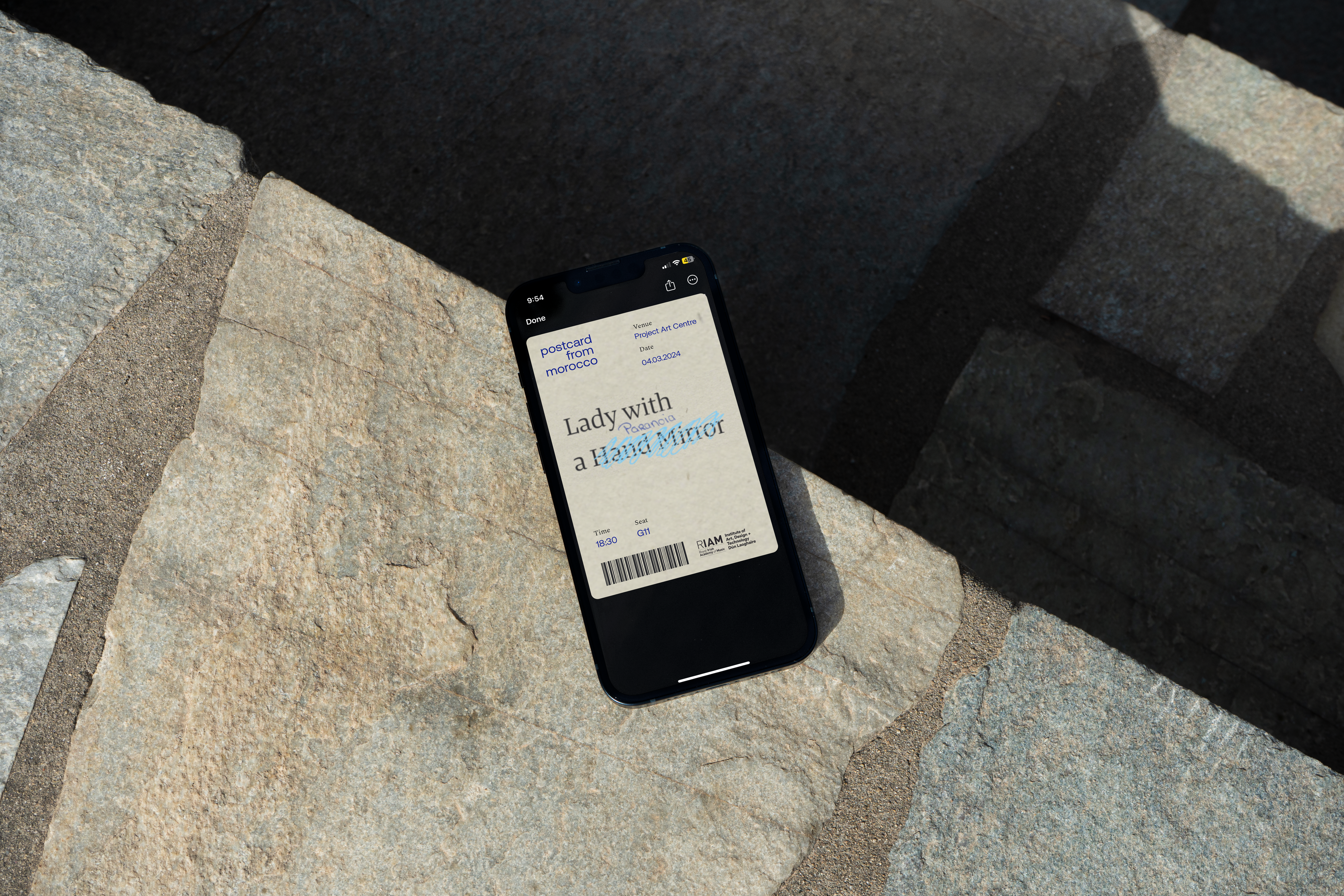
Extending the identity to the digital realm.
To create a cohesive experience across both physical and digital touchpoints, I adapted the typographic system for e-tickets. The design maintained the same visual language, with character descriptions and handwritten annotations, but was optimized for screen viewing. This ensured that the identity remained consistent and engaging, regardless of the medium through which audiences interacted with it.